Showing posts with label Ruthie Sommers. Show all posts

2.20.2013

My Nursery Design Philosphy


A lot of folks around me seem to have partaken of the conceiving waters.  Preggos everywhere I turn, whether IRL or on the interwebs. My sasster is on her 4th go round.  I cannot even imagine.  As with each one, she is not finding out the gender.  Whatever.  That just fractures my control-craving brain.  I LOVE obsessing about nurseries.  I especially love nurseries that don’t scream ‘baby’ or my name is ‘…’ As if you don’t know your own baby’s name.  Since sass is no help in the gender department, I put together two designs, one for a boy and one for a girl.  These are purely for fun as she is sticking to a neutral palette.  I, however, don’t really ‘do’ neutral.  I also don’t do ‘not finding out.’  And unless you have Bey/Jayz crazy money, I also believe it is imperative to design a nursery that will grow with your child.


This isn’t my sister's first rodeo, she knows the drill.  But for those of you on your first, here is my philosophy on nurseries - forget about dedicated nursery furniture aside from a safe crib.  Use or invest in foundational pieces that will transition with each stage of development or into other rooms in your house.  Makin babies is a spendy endeavor, so where possible, re-purpose pieces that you already have.  As hard as it is to imagine, the wee baby stage is truly a blink of an eye so look at your choices with the long view in mind.  As you can see here, I put together rooms that would have longevity.  The foundation pieces can really work anywhere.  To add levity to the foundation, I like to inject some fun or quirky element.  In the boy's design, the asses have it.  I mean, come on.  Baby donkeys = awesome redonkey donkness.  In the girl's design, I like the idea of shoving two blinged out side tables together and paring them with the modern lines of the grey rocker.  And that ceramic maltese?  Well, that's my Ruthie homage.  And as always, toys and accessories will keep the room age specific, as your child grows.

Let me know if you are interested in sources.  The blue abstract can be found here.  The Rorschach ink blot can be found here.  Love both of these art pieces hard.

All layouts by mrs. V

kisses,  mrs. V


2.12.2013

Tales from the Projects - Dip Dye Lampshade


Let me begin by apologizing for the pictures.  The mr. took off with my camera this morning – rude –  before I realized that I had not downloaded the pictures of this project.  So, stuck with crappy phone pics.

Ruthie's lampshade

Like most of my plans, grandiose visions were high and pink.  The pink lampshade idea came from an old Ruthie Sommers image.  A small snippet in HB a while ago (probably the awesome 'pink' issue) about her kitchen lamp with a pink shade.  People have been poking fun of my adoration of pink – ahem, Lulu and Ayars -  for even longer than they have poked fun of my love of animal print.  But hey, I cannot deny who I am and what I love.  So a pink lampshade should come as no surprise.  Not bright pink, not little girl candy pink, but more like a Georgia O’Keefe great pussini pink.  Rich, lovely, and deep.  That’s what I was going for anyway, and not exactly what I got.


I don’t hate it but I don’t worship it either.  Not a total wash because I learned a couple of valuable things.  First, it has finally come to my attention, that ALL of my grandiose plans require a bail out from the mr. at some point in the project.  I grossly underestimated the amount of water required to dip a 16” lampshade.  Second, before you dip your proverbial lampshade in the dye waters yourself, consider starting with a smaller one.  Third, get more dye than you will think you need.  Nothing is more annoying than making 3 trips to the craft place for more dye.

Project lampshade dip went down like this:  after a long, exhaustive search for colored lampshades or fancy trims, I determined that both were cost prohibitive for the size of shade I needed.  I briefly considered spray paint but given my proclivity of catching things on fire, I thought the risk not worth the reward.  Not to mention that I can’t spray paint to save my life.  Drip city.  Not wanting to rely upon the mr. on this one (he is a spray paint master), I decided upon dye.  Super cheap.  I scoped out dye colors for months.  Finally I pulled the trigger and quickly realized that like Donny, I was out of my element.  How many liters in a gallon?  How many gallons per packet?  How many dye packets would I need?  What container can I use?  Where do I go with all that dye water?
 
You can see where I am going with this.  Help!  Sink was not an option b/c it wasn’t big enough.  A laundry tub would have worked but ours is not plumbed at the moment.  The biggest container we had was a plastic bin that while empty, was deep and wide enough for the lampshade, but when filled with vast amounts of pink water looked like a disaster waiting to happen.  Could not fill up high enough to cover the entire lampshade so I had to flip that sucker every 15 minutes in hopes that I would get an even dip.  I did not want ombre.  In the end, we avoided disaster but it took two of us to deal with the water disposal b/c 20+ gallons of water is HEAVY.  Doing this twice is not necessarily fun.  Having to do it a third time to get the color I want, is even more not fun.  Plus, I feel like fate and the DIY gods will conspire to bring me those darker floors that I have always wanted, albeit it in a pink shade.

this is happening in the kitchen so I put trash bags down over my hardwoods
massive bowing out on the sides = pink floor anxiety

when i dip, you dip, we dip
and then we flip, many times to avoid a dye line


So I will live with it for now until the weather is warmer and I can do this shizzo outside.  Thumbs down for now.  To be continued…

All photos and layouts by mrs. V

kisses,  mrs. V


7.02.2012

Shopping 1stdibs


Let’s Play Pretend – the Holly Go-Lightly Version

These light fixtures have caught my eye.  You know, for times when I like to play pretend that money is no object.  And during those delusional times, I shop 1stdibs.  Because when we are talking stupid money, why would I buy something that everyone else has?


Clearly my love of brass knows no end.  I would find places for each one of these.

1 – 70s Swerve / 2 – Ribbed Vessels on Lucite / 3 – 70s Sexy Beasts / 4 – Rotating Console Lamps / 5 – 60s Billy Haines style / 6 – Rembrandt Parrot Lamps


Since these are clearly my boozy Gilded Age daydreams, I see no reason not to further gild the lily.

1 – Empire style gilt / 2 – 40s Italian gilt tole crystal  (perfect for Pieti's big girl room) / 3 – Antique Frenchy Swan goodness (if bling ain’t your thang) / 4 – 60s Austrian beaded business (if you are looking to get your Meares on) / 5 – 40s French Peachy Keen crystal (for that dressing room that I don’t have ) / 6 – 19th Century French crystal (would be lurvely in a kitchen over a marble topped island )/ 7 – French Art Nouveau (for a nod of masculinity) / 8 – Baltic style badass (for that inner oligarch)


Each of those Unusual Suspects promises a spin on the expected of-the-moment options.

1- 40s Hollywood glam (like diamond studs for my hallway) / 2 – Bronze and crystal flush mount (a little crowning sexiness for my dark bathroom) / 3 – Italian industrial (a kitchen alternative to those predictable industrial pendants) / 4 – Hand-blown Latticino glass leaves (for a modish balance in my trad LR) / 5 – Lucite antlers (the glam girl’s version of chalet chic – or as my cousin likes to say, the bomb titty bow wow - for my beamed tile room) / 6 – Audoux Minet 50s rope chandelier (to scratch that 50 shades itch of all things rope) / 7 – Bakalowits crystal sputnik (another option for the hallway to cast crazy rays)


Sometimes you just need to make a simple point.

1 – 70s neoclassical style sconces / 2 – Bronze zodiac lamps / 3 – Eric Cohler Armillary Sphere*  / 4 – Chart House Leaf and Arrow Chandelier*
*From Visual Comfort not 1stdibs.


Because who doesn’t appreciate a well-hung form?  Hmm?

1 – 60s Artemide enameled metal & glass (a good alternative to the ever present Hicks pendant) / 2 – Capiz globe pendant (another good globe alternative to the Hicks) / 3 – White opaline glass pendant (the polychrome decoration is so interesting) / 4 – Arts and Crafts milk glass pendant (another great option for kitchen pendants) / 5 – Japanese brass globe (in my tiny entry) / 6 – Vintage Moravian Star (would be super cool in a small dark bath)


While I am busy daydreaming, I never forget to pretend that I also live in Palm Beach.

1 – 60s Maison Charles sheaf lamp (a femme version of a bouillotte lamp)/ 2 – Italian floral lamps (add delicate symmetry to a parson’s style console) / 3 – John Rosselli Alyssa chandelier* (a graceful note) / 4 – Maison Jensen palm tree floor lamp (for some serious Palm Beach flair) / 5 – Italian gilt metal bamboo (for a Ruthie Sommers style sunroom) / 6 – Sheaf of wheat lamp (perfect for that accent table)
*From Visual Comfort not 1stdibs.


Let’s not forget some lovely lady lumps and pleasing forms.


1 – Bari Ziperstein ceramic bust (a glammy whammy) / 2 – Desimone table lamp (for an artsy Cubist style swerve) / 3 – Frances Elkins tree form floor lamp (originally made for Elkin’s daughter!) / 4 – Plaster drape lamps (like lovely gowned ladies – great for a fashionista’s office or dressing area) / 5 – French opaline lamps (another shapely form – these would inject a burst of color)


I feel the same way about Chinoiserie as I do brass – my love knows no bounds -  a timeless element in any room.

1 – Tea cannister lamps (every room needs some black) / 2 – Tole bamboo chandelier (for even more Ruthie Sommers flair – but I would swap out those shades) 3 – Italian pottery monkey lamp (a dose of Palm Beach Regency) 4 – Antique Imari lamps (same feel as Chinoiserie) / 5 – 60s porcelain lamps (quintessentially Chinois-y) / 6 – Chinese blue and white vessels turned lamps (would compliment my growing collection)


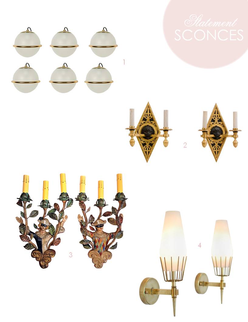
Sconces add the perfect mood lighting and symmetry.

1 – 50s Italian Arteluce sconces (a pair would be everything over a bathroom vanity) / 2 – French bronze and ormolu lion head sconces (for a serious note) / 3 – Italian antique sconces (there is no substitute for real patina) / 4 – Arrodeluce attributed sconces (for some Palm Springs swagger a la David Jimenez)


When you need a dash of color, blue is a classic choice.

1 – 60s blue glass lamps (l want to channel Christy Ford!) / 2 – 50s Marbro Italian lamps (because I can never get enough blue and white) / 3 – Scandanavian glass lamps (Christy has multiples and so must I!) / 4 – French opaline (so good had to share again)


When all else fails, fake it until you make it.  A little crafting could yield similar results.

1 – 50s Earthenware lamps (for those chevron lovers – Danika could do these lickity split) / 2 – Tole bouquet lamps (colored card stock or spray painted thin metal) / 3 – Italian ceramic lamps (an easy project for thrifted lamps)


Happy Monday.

All layouts by mrs. V
kisses, mrs. V