Showing posts with label Visual Comfort. Show all posts

8.20.2014

Living - Our Table


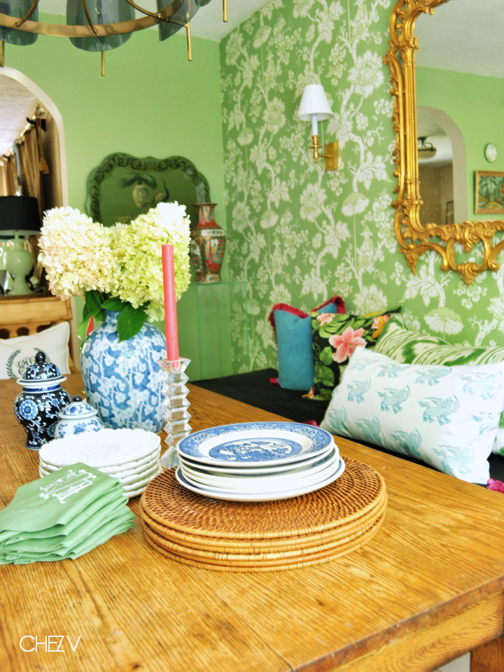
Enjoying these last days of Summer.  My late blooming hydrangea bushes are still going bonkers and our table is all the more beautiful for it.  These will dry beautifully.

In other news, I finally got around to adding tassels to one of my Fantastical Beastie pillows that is long, long, long overdue to a dear friend.  I printed this pillow more than 6 months ago.  Sheesh.  Now that I have proper time, I am devoting more energy to my block prints.


Off to roast a chicken for that table.


All photos and styling by Emily Vanderputten

kisses,  mrs. V

4.30.2014

One Room Challenge - Week Five - Painting, Lights, and Wallpaper

Welcome back to week 5 of The One Room Challenge™.   Thank you for following this crazy ride as I re-do the dine-in portion of my kitchen which involves finishing out a banquette, upholstery, paint, wallpaper and lighting.  As I type this, I am sort of in denial that I have one week left to pull off this room. In true panicky fashion, I took to cleaning my bathroom baseboards with a toothbrush this morning.  So what.  Tell me I’m not alone in addressing looming deadlines with soul crushing procrastination.  To catch up with my shenanigans from the beginning, click the following links below:

WEEK 1:  Plan & Inspiration
WEEK 2:  Progress Report – Floors
WEEK 3:  Electricity
WEEK 4:  Upholstery

If you are super smart and totally, like totally, cool, then you are already following life chez V on IG and you will have seen these dreams that are made of these.  And by dreams, I mean my recurrent prepster yet irreverent Chinoiserie filled dreams which involve things like this supremely gorgeous Scalamandre wallpaper which went up today thanks to the brilliant install by Liz and Bill of Natural Look Painting & Decorating.  Cincy & Dayton peeps, give these folks a shout if you need any wallpapering or painting done!


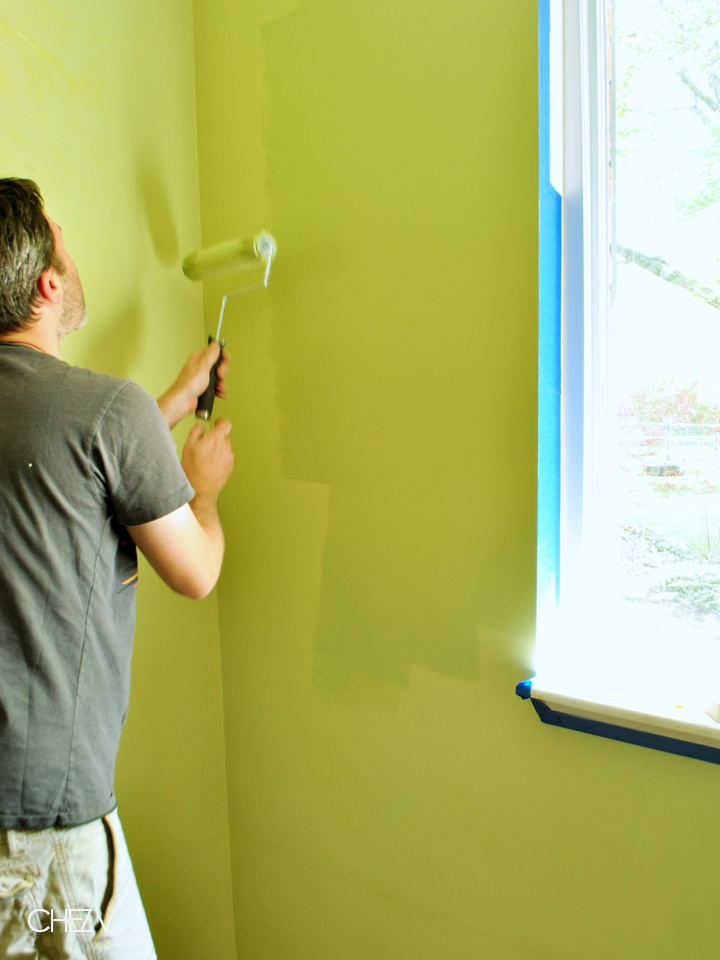
But before I introduce you to my hotty wallpaper, let’s revisit a few other obsessions of mine:  color and lighting - two things that can instantly transform any room.  So last week I was lamenting that we didn’t have paint on the walls due to ElectricityGate but now I am happy to report that the walls have been painted.  Sherwin-Williams graciously provided the wall paint and I could not be happier with the results.  


Not only is the customer service on the corporate side impeccable but the guys at my local store are rock stars and deserve a shout out. They are always so helpful whenever I am in there and even helped me with my floor stain/poly sitch when I wasn’t even for shopping for floor stuff! I have painted more than my fair share of stuff along the way and can say based on experience that quality paint makes all the difference in the world.  My family and I have been using Sherwin-Williams products for a long time.  My front door is painted with SW paints as well as my kitchen cabinets which I painted a few years ago and have stood up to our daily traffic beautifully.  I used the ProClassic Interior Acrylic Latex Enamel in white on the cabinets and plan on using more to repaint the trim this week.  For the kitchen walls, I selected Great Green SW 6430 in semi-gloss from the Emerald line which was color matched to my wallpaper.  The color is very similar to what was previously on the walls but more pigmented.  The Emerald line went on smoothly with excellent coverage.  But there was a brief moment when the mister and I howled because when the paint was first going up it looked identical to the previous color.  However, once it began to dry, the deeper pigmentation began to come through.  With tons of light, this kitchen can easily handle a deeper pigmented color.  Officially living for this more mature color.


What the what?!  This looks like the same color that is already on the walls.


Dried beautifully into a deeper, more mature green


The color is quite smashing with the wallpaper


As to lighting:  typically I’m a vintage gal all the way when it comes to lighting.  But there are certain occasions when I stumble on a new light that simply cannot be ignored - like my Ranarp sconces and my Jonathan Adler foo dogs from my previous ORC room.  And my Ballard Designs pendant that I just scored at the outlet for this room.  Or any of the multitude of great lamps at Home Goods.  Lamps Plus is another great source and graciously provided us with lighting for this challenge.  Now I have to say that I was blown away by the sheer magnitude of the selection and not only just lighting.  So many great choices that it was hard to choose but I knew that I wanted some sconces flanking my vintage pagoda mirror to add some ambient lighting to the banquette area.  I selected Visual Comfort’s Bill Blass library sconces in brass and again was blown away by Lamps Plus customer service, the timeliness of delivery (only a few days!), and the quality of the light.  Very, very impressed.


And now, allow me to properly introduce my new beau hunk, Parapluie.  The mister forgives me my wallpaper dalliance with the express understanding that ‘Luie replaces  someone in my elevator.  Luie plays nicey with the other kids in the sandbox, particularly the sconces and my pagoda mirror.  Sadly, it would seem that Parapluie in this green colorway is no longer available from Scalamandre as I bought up the last remaining lot which just so happened to be the exact amount I needed #amatchmadeinheaven #sorrynotsorry.  But you can find other Parapluie colorways via sku# WP88216 on the Scalamandre site.  


I am already envisioning many a boozy night with lots of laughter and friends sequestered comfortably on the banquette against Luie’s beautimous backdrop.  Scratch.  Oh yes, the banquette, that elusive design element.  We still have to finish all of our sewing for the banquette cushions and pillows, figure out art placement (got some great stuff coming from Jennifer at The Pink Pagoda!!!), and I have yet to begin sourcing accessories.  Also, I have one major design element planned for the room that literally pulls everything together like Lebowski’s rug that will likely not be ready in time.  Wah, wah, wah.  Looks like rather than Donnie, I will be the one out of my element for the big reveal but I still think it’s gonna be real good. This is what I've accomplished and lots more upholstery is what I got up my sleeve for this week...


Did I mention that I got a wild hair to tile my backsplash this weekend? The mister hates me for real and for true.

As far as dreams intersecting with reality, I can safely tell you that based on the wallpaper alone, I will be obsessed with this room for life or longer.  Or at least for two weeks until such time that I turn my sights to my outdoor patio room where major patio perching happens on the regular during the warmer months.

Love ya, mean it.  Now go check out my girls…


A special thank you to the following sponsors and supporters of Chez V and The One Room Challenge that are graciously providing items to help me bring my vision for this room to life:


All photos and styling by Emily Vanderputten unless otherwise noted

kisses,  mrs. V

7.02.2012

Shopping 1stdibs


Let’s Play Pretend – the Holly Go-Lightly Version

These light fixtures have caught my eye.  You know, for times when I like to play pretend that money is no object.  And during those delusional times, I shop 1stdibs.  Because when we are talking stupid money, why would I buy something that everyone else has?


Clearly my love of brass knows no end.  I would find places for each one of these.

1 – 70s Swerve / 2 – Ribbed Vessels on Lucite / 3 – 70s Sexy Beasts / 4 – Rotating Console Lamps / 5 – 60s Billy Haines style / 6 – Rembrandt Parrot Lamps


Since these are clearly my boozy Gilded Age daydreams, I see no reason not to further gild the lily.

1 – Empire style gilt / 2 – 40s Italian gilt tole crystal  (perfect for Pieti's big girl room) / 3 – Antique Frenchy Swan goodness (if bling ain’t your thang) / 4 – 60s Austrian beaded business (if you are looking to get your Meares on) / 5 – 40s French Peachy Keen crystal (for that dressing room that I don’t have ) / 6 – 19th Century French crystal (would be lurvely in a kitchen over a marble topped island )/ 7 – French Art Nouveau (for a nod of masculinity) / 8 – Baltic style badass (for that inner oligarch)


Each of those Unusual Suspects promises a spin on the expected of-the-moment options.

1- 40s Hollywood glam (like diamond studs for my hallway) / 2 – Bronze and crystal flush mount (a little crowning sexiness for my dark bathroom) / 3 – Italian industrial (a kitchen alternative to those predictable industrial pendants) / 4 – Hand-blown Latticino glass leaves (for a modish balance in my trad LR) / 5 – Lucite antlers (the glam girl’s version of chalet chic – or as my cousin likes to say, the bomb titty bow wow - for my beamed tile room) / 6 – Audoux Minet 50s rope chandelier (to scratch that 50 shades itch of all things rope) / 7 – Bakalowits crystal sputnik (another option for the hallway to cast crazy rays)


Sometimes you just need to make a simple point.

1 – 70s neoclassical style sconces / 2 – Bronze zodiac lamps / 3 – Eric Cohler Armillary Sphere*  / 4 – Chart House Leaf and Arrow Chandelier*
*From Visual Comfort not 1stdibs.


Because who doesn’t appreciate a well-hung form?  Hmm?

1 – 60s Artemide enameled metal & glass (a good alternative to the ever present Hicks pendant) / 2 – Capiz globe pendant (another good globe alternative to the Hicks) / 3 – White opaline glass pendant (the polychrome decoration is so interesting) / 4 – Arts and Crafts milk glass pendant (another great option for kitchen pendants) / 5 – Japanese brass globe (in my tiny entry) / 6 – Vintage Moravian Star (would be super cool in a small dark bath)


While I am busy daydreaming, I never forget to pretend that I also live in Palm Beach.

1 – 60s Maison Charles sheaf lamp (a femme version of a bouillotte lamp)/ 2 – Italian floral lamps (add delicate symmetry to a parson’s style console) / 3 – John Rosselli Alyssa chandelier* (a graceful note) / 4 – Maison Jensen palm tree floor lamp (for some serious Palm Beach flair) / 5 – Italian gilt metal bamboo (for a Ruthie Sommers style sunroom) / 6 – Sheaf of wheat lamp (perfect for that accent table)
*From Visual Comfort not 1stdibs.


Let’s not forget some lovely lady lumps and pleasing forms.


1 – Bari Ziperstein ceramic bust (a glammy whammy) / 2 – Desimone table lamp (for an artsy Cubist style swerve) / 3 – Frances Elkins tree form floor lamp (originally made for Elkin’s daughter!) / 4 – Plaster drape lamps (like lovely gowned ladies – great for a fashionista’s office or dressing area) / 5 – French opaline lamps (another shapely form – these would inject a burst of color)


I feel the same way about Chinoiserie as I do brass – my love knows no bounds -  a timeless element in any room.

1 – Tea cannister lamps (every room needs some black) / 2 – Tole bamboo chandelier (for even more Ruthie Sommers flair – but I would swap out those shades) 3 – Italian pottery monkey lamp (a dose of Palm Beach Regency) 4 – Antique Imari lamps (same feel as Chinoiserie) / 5 – 60s porcelain lamps (quintessentially Chinois-y) / 6 – Chinese blue and white vessels turned lamps (would compliment my growing collection)


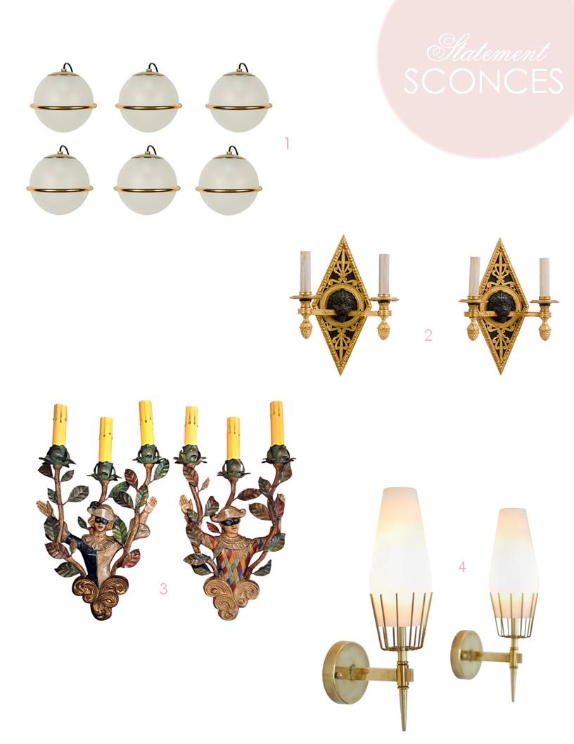
Sconces add the perfect mood lighting and symmetry.

1 – 50s Italian Arteluce sconces (a pair would be everything over a bathroom vanity) / 2 – French bronze and ormolu lion head sconces (for a serious note) / 3 – Italian antique sconces (there is no substitute for real patina) / 4 – Arrodeluce attributed sconces (for some Palm Springs swagger a la David Jimenez)


When you need a dash of color, blue is a classic choice.

1 – 60s blue glass lamps (l want to channel Christy Ford!) / 2 – 50s Marbro Italian lamps (because I can never get enough blue and white) / 3 – Scandanavian glass lamps (Christy has multiples and so must I!) / 4 – French opaline (so good had to share again)


When all else fails, fake it until you make it.  A little crafting could yield similar results.

1 – 50s Earthenware lamps (for those chevron lovers – Danika could do these lickity split) / 2 – Tole bouquet lamps (colored card stock or spray painted thin metal) / 3 – Italian ceramic lamps (an easy project for thrifted lamps)


Happy Monday.

All layouts by mrs. V
kisses, mrs. V